Appearance
Props
There are several ways for defining props
typescript
const props = defineProps<{
  // props definition here
}>();
or
typescript
type Props = {
  // props definition here
}
const props = defineProps<Props>();
With defaults
javascript
const props = withDefaults(definePropsStatementHere, {
  // defaults here
});
Storybook autodocs will create argTypes from it.
Suported types
string
typescript
type Props = {
  name: string;
}
number
typescript
type Props = {
  age: number;
}
boolean
typescript
type Props = {
  enabled: boolean;
}
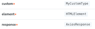
custom type
typescript
type Props = {
  custom: ACustomType;
  element: HTMLElement;
  response: AxiosReponse;
}
Array
Array of any supported type. Can be defined as type[] or Array<type>;
typescript
type Props = {
selectors: string[];
ids: Array<string>;
customArray: MyCustomType[];
option: Array<{ id: string, enabled: boolean}>;
}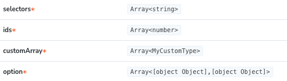 array of objects is in TODO
union
Union of any suported type
of similar types:
typescript
type Props = {
  type: "success" | "warning" | "error";
  padding: 0 | 8 | 16 | 32,
}
of different types:
typescript
type Props = {
target: string | HTMLElement,
size: "small" | "medium" | "large" | number;
popup: boolean | { element: string[] }
}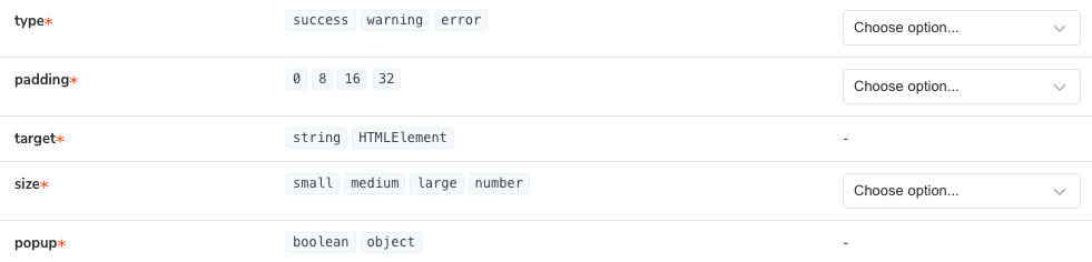 Union of string/number will show the "choose option" dropdown with corresponding values
Object
typescript
type Props = {
object: { id: string, enabled: boolean}
}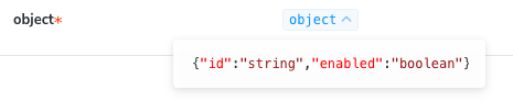 Object details are shown as storybook details
Function
typescript
type Props = {
callback: (name: string) => void;
}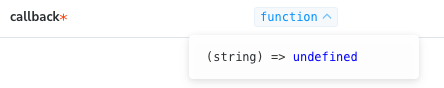 Functions details are shown in storybook details. @TODO: fix infering of return statement
Default values
Default values are read form the withDefaults macro. Supported types: string number boolean WIP: array object